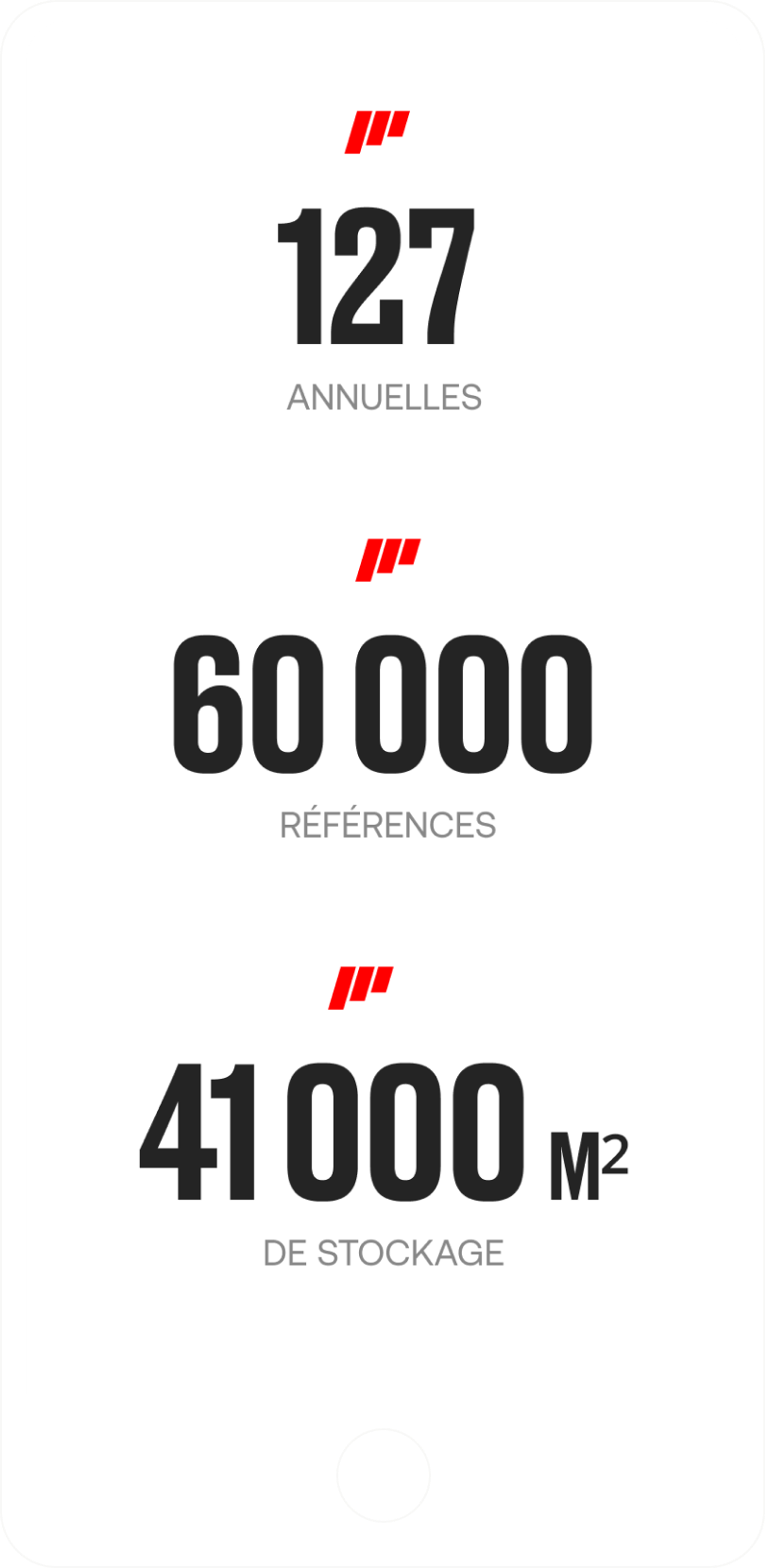
Hifi Filter
Your filtration partner

- Art Direction
- Conception
- UX/UI
- Front-end development
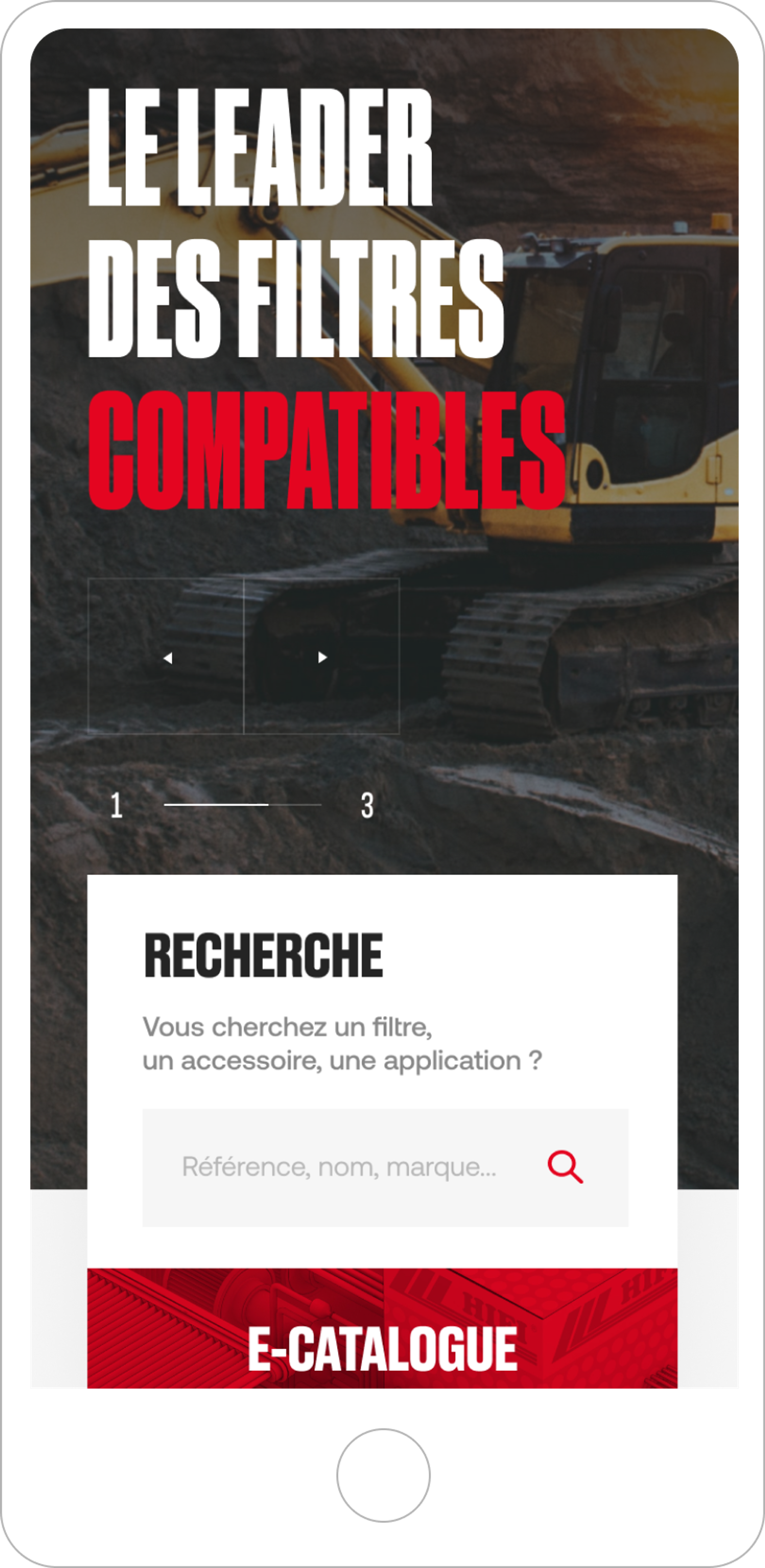
HIFI FILTER, specialized in filtration and separation solutions for mobile equipment and industrial processes, enlisted our services for the creation of a custom showcase website. The goal was to highlight their range of high-performance filters and to strengthen their presence as a reference partner among professionals.
Art direction
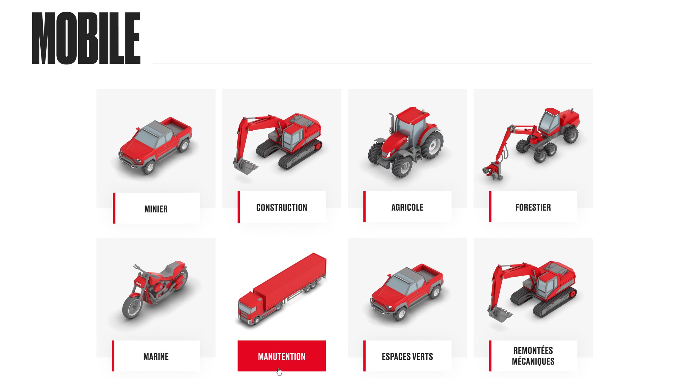
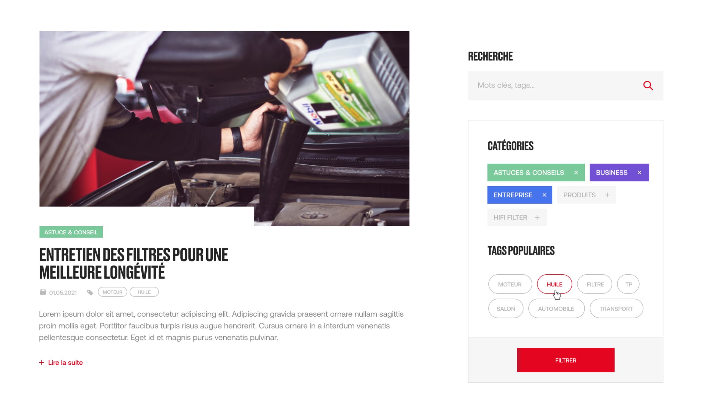
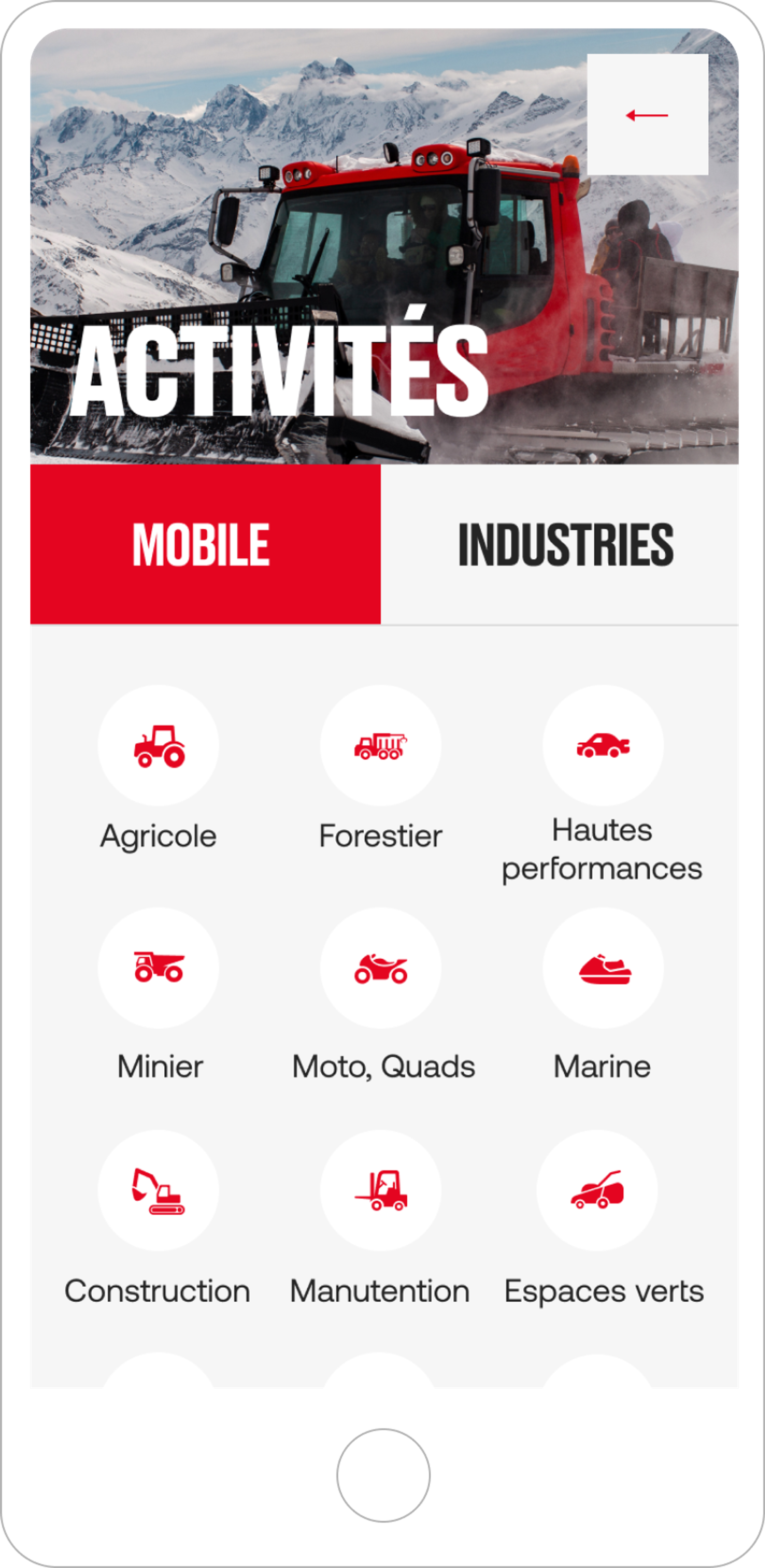
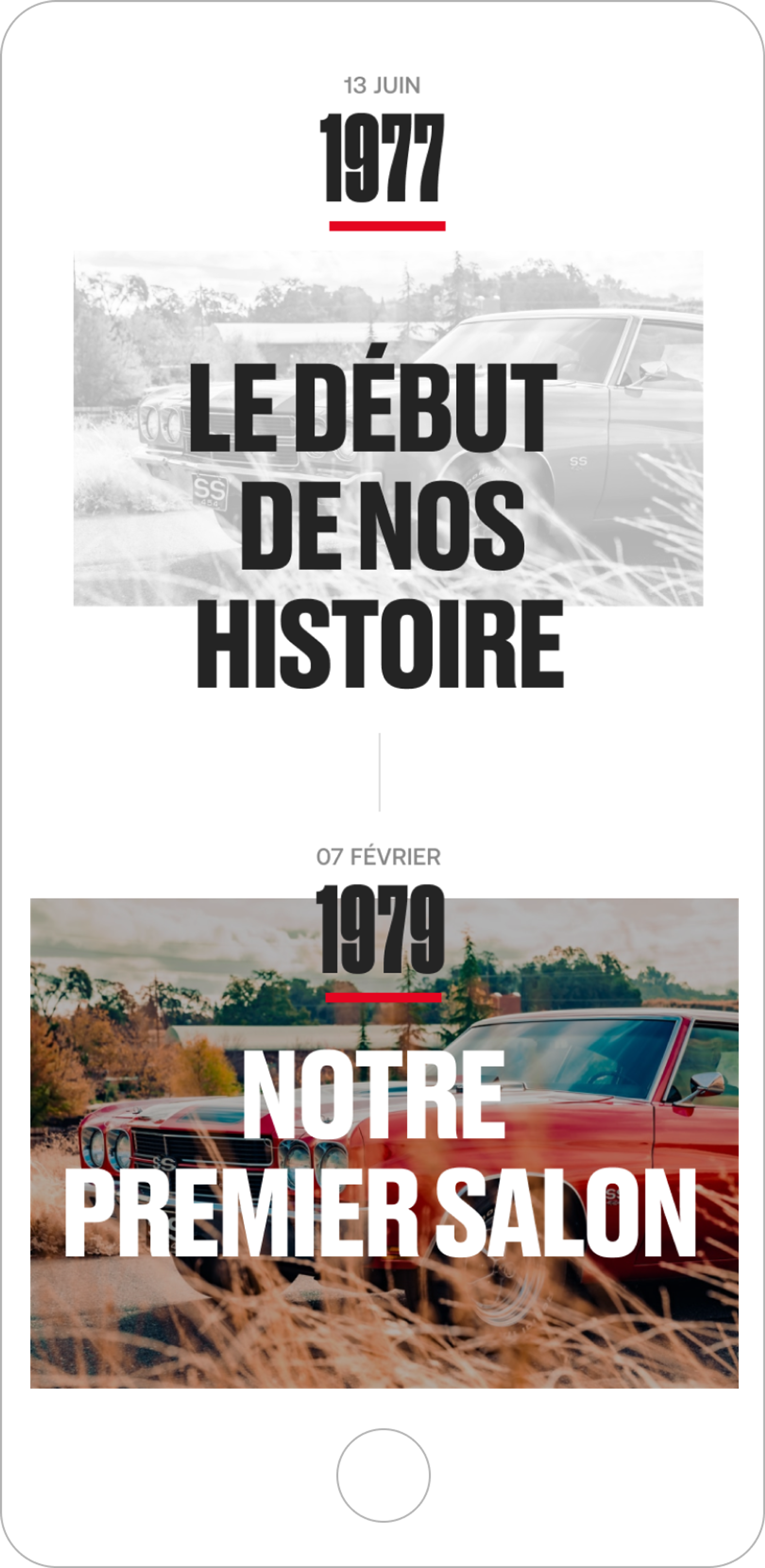
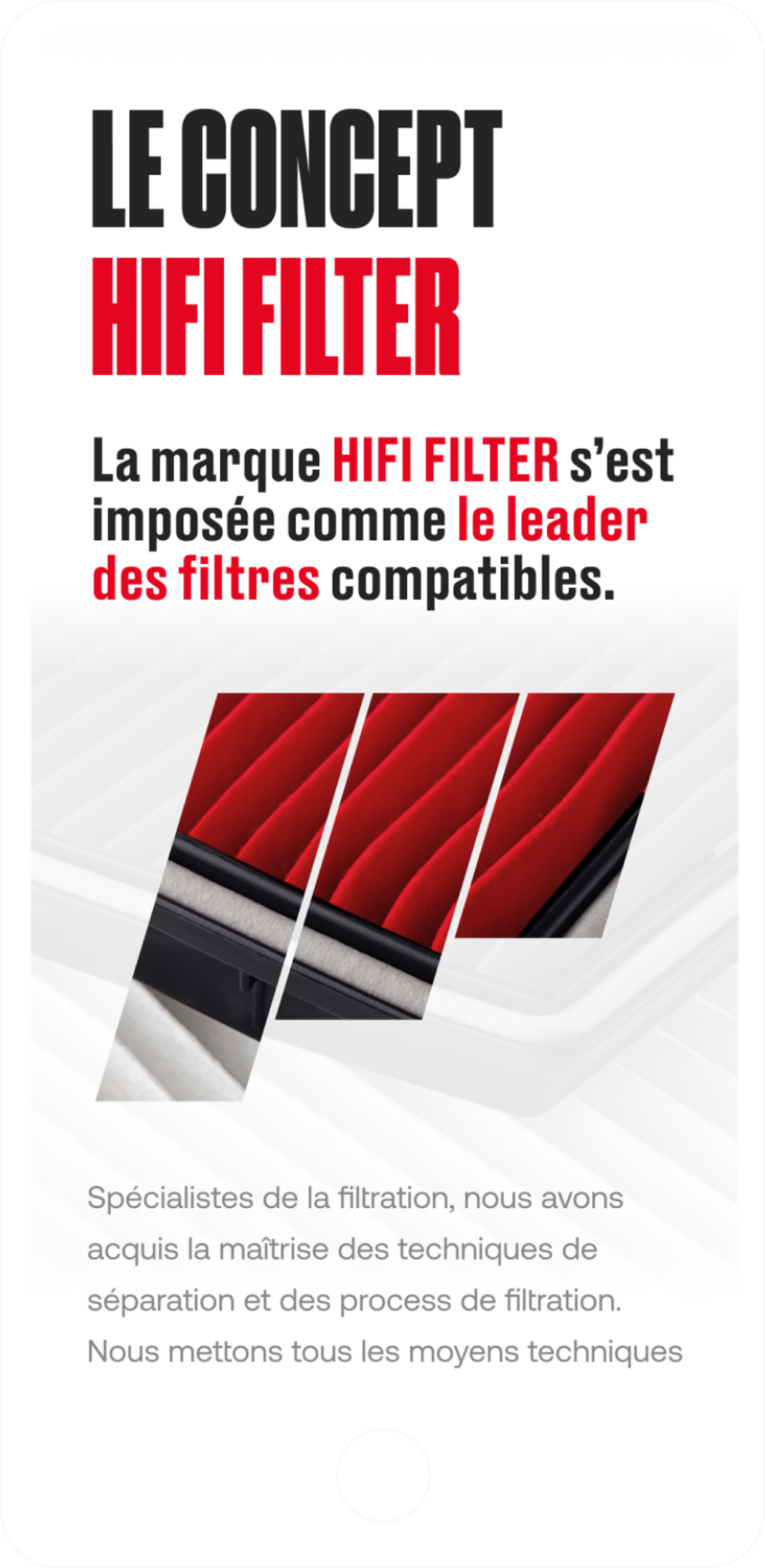
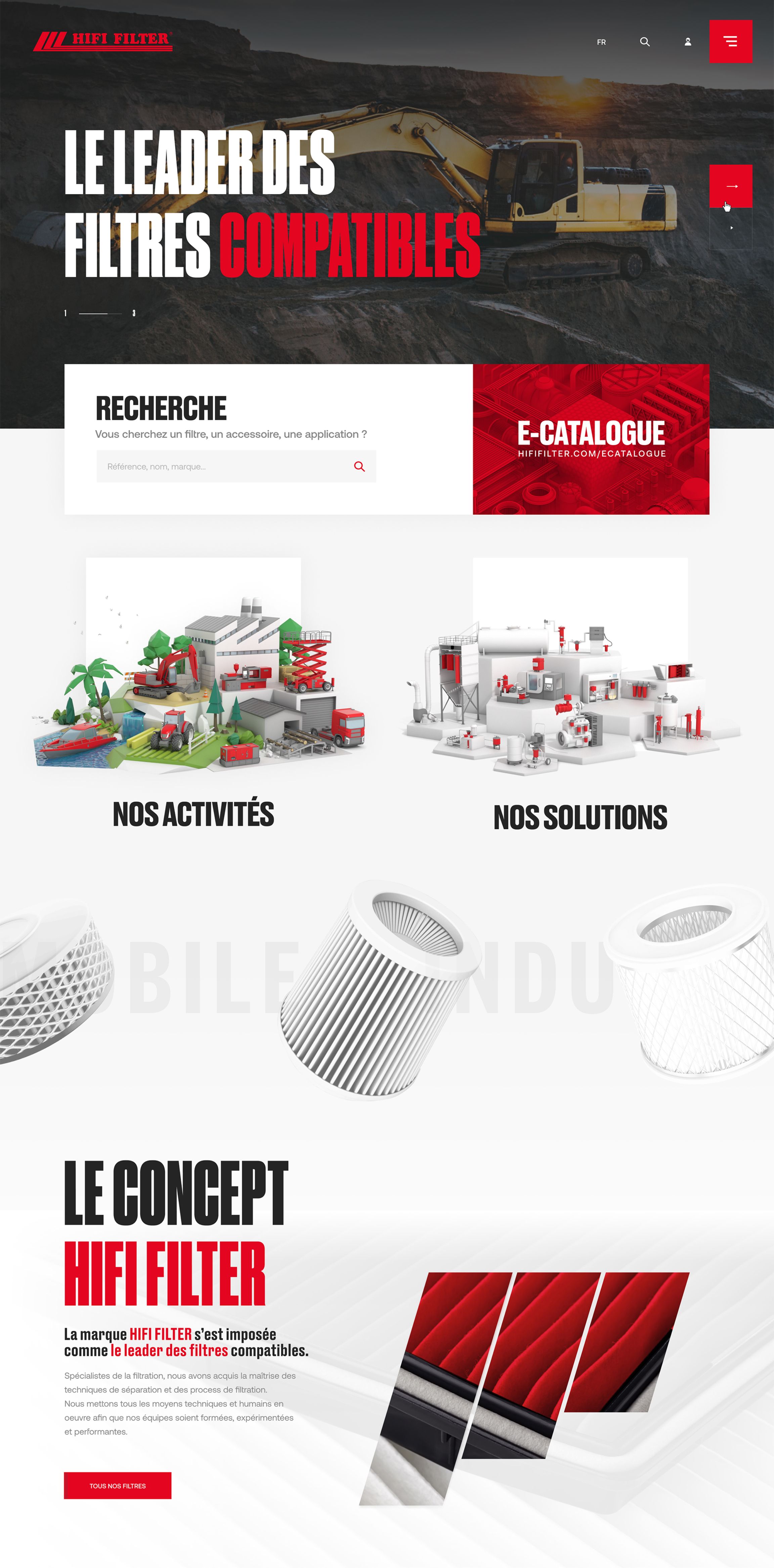
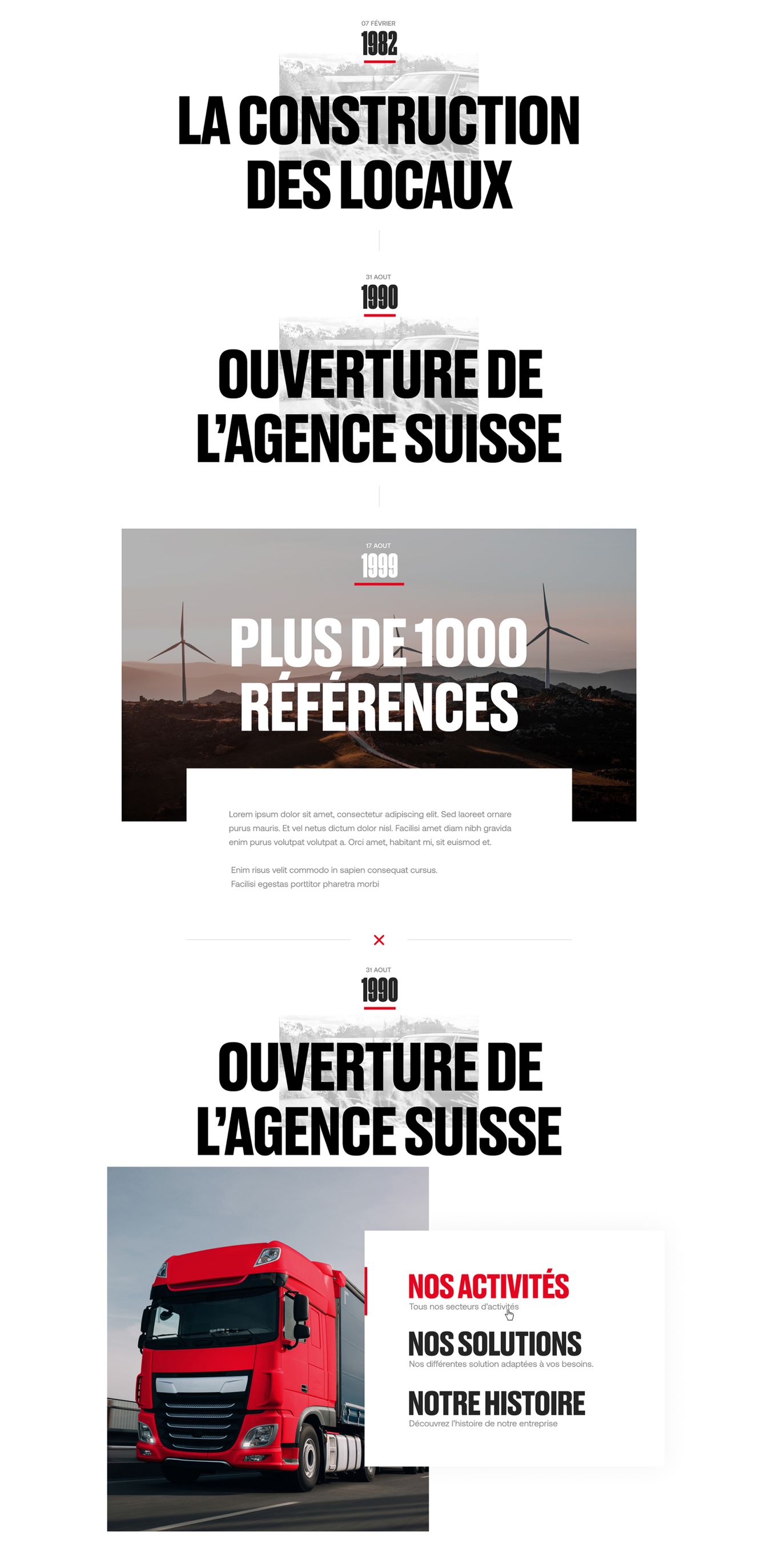
For the HIFI FILTER website, we took charge of the art direction by creating a sleek and modern design. Using large headlines and the color red for a punchy look, we aimed to give their site a dynamic appearance. Collaborating with Hocus Pocus for the 3D part of the filters added a nice touch to the whole.
Burger menu
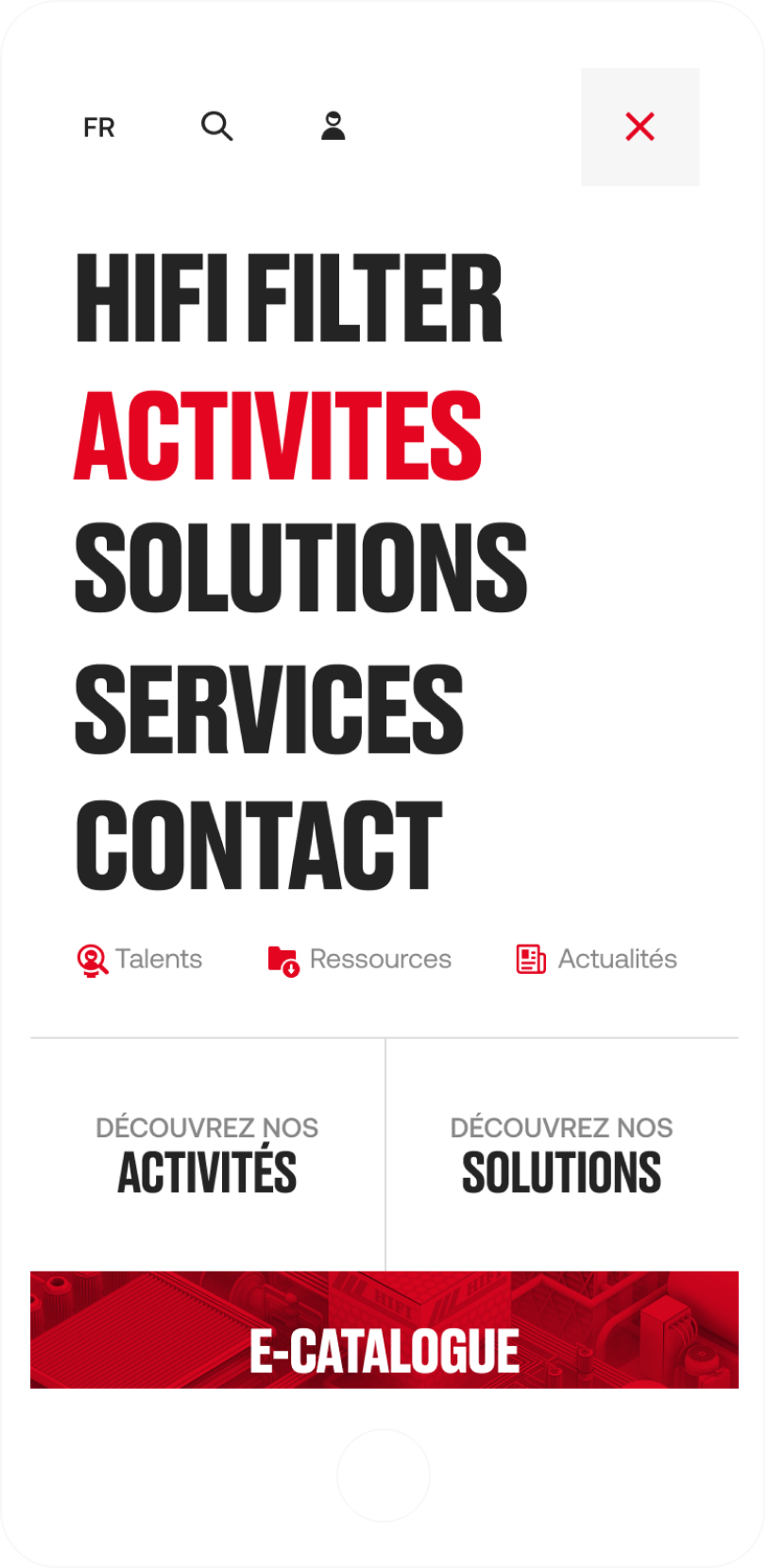
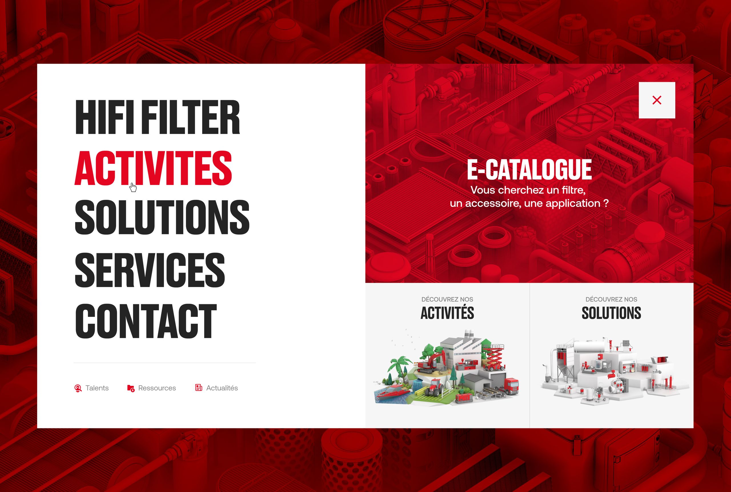
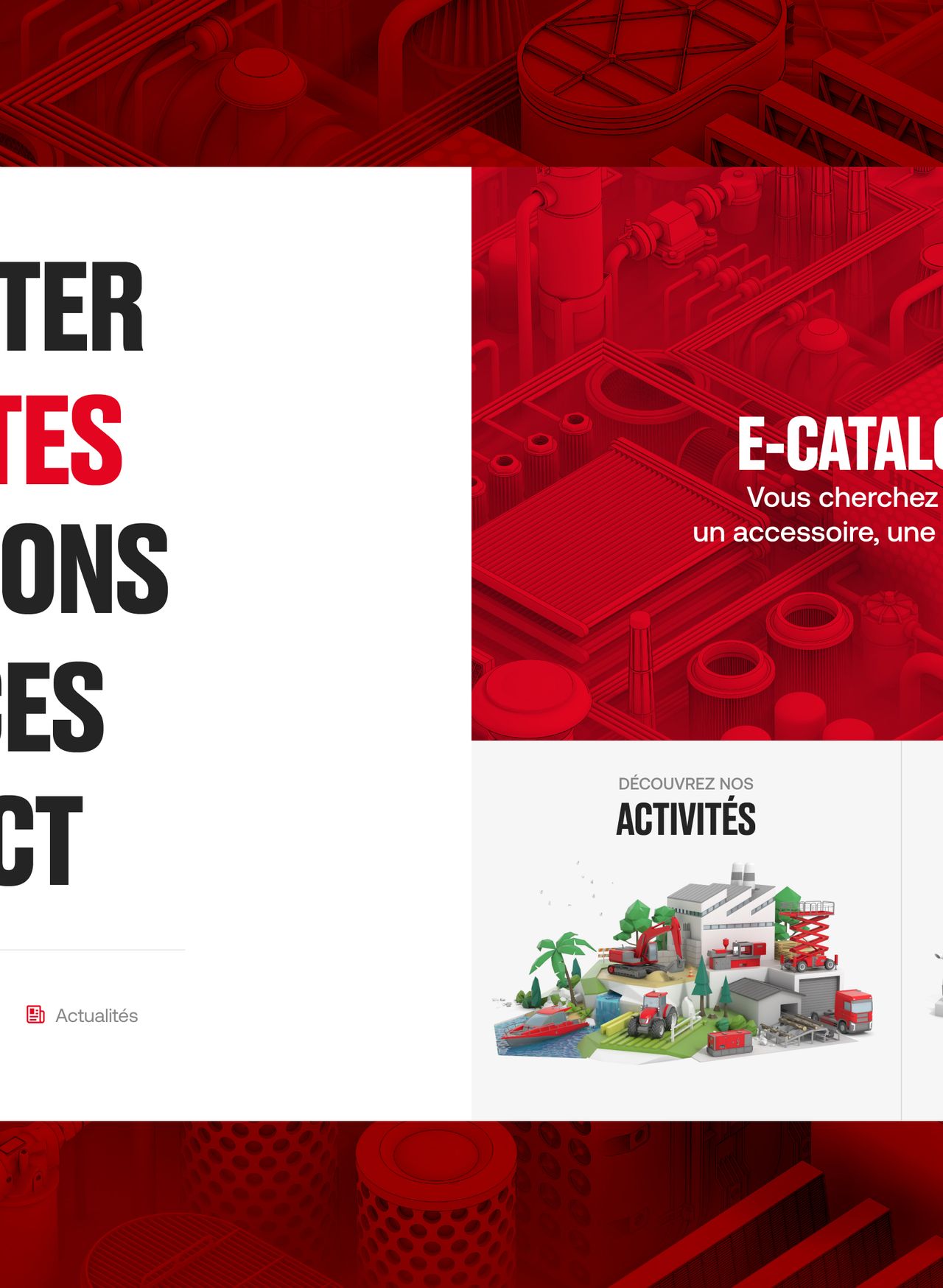
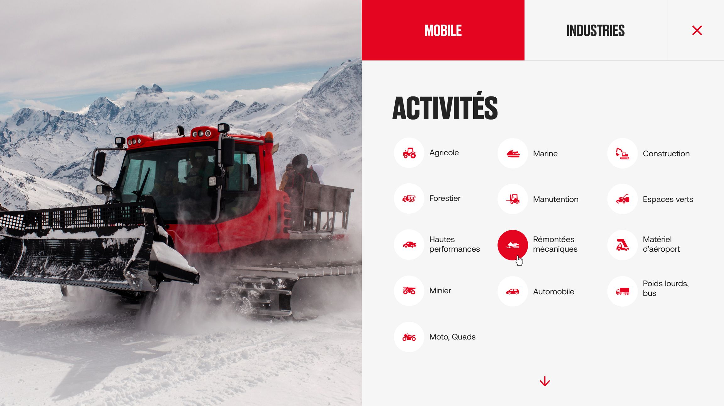
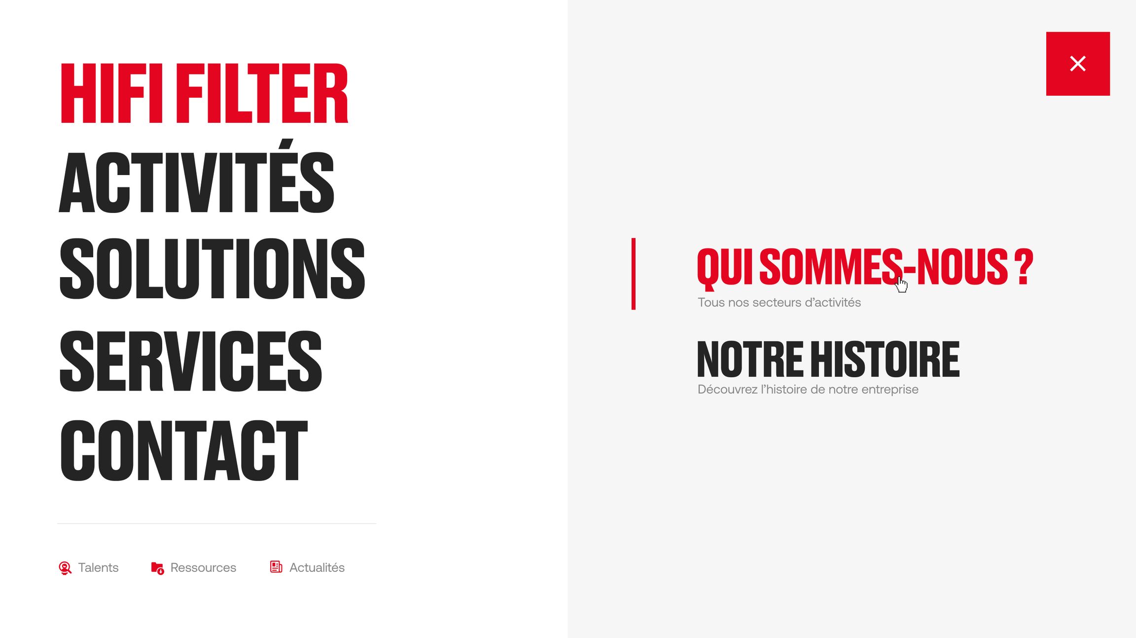
We opted for a full-screen burger menu to facilitate navigation and more clearly prioritize the various products and areas of Hifi Filter. This approach allows for a structured view of all services and products from the moment the menu is opened.


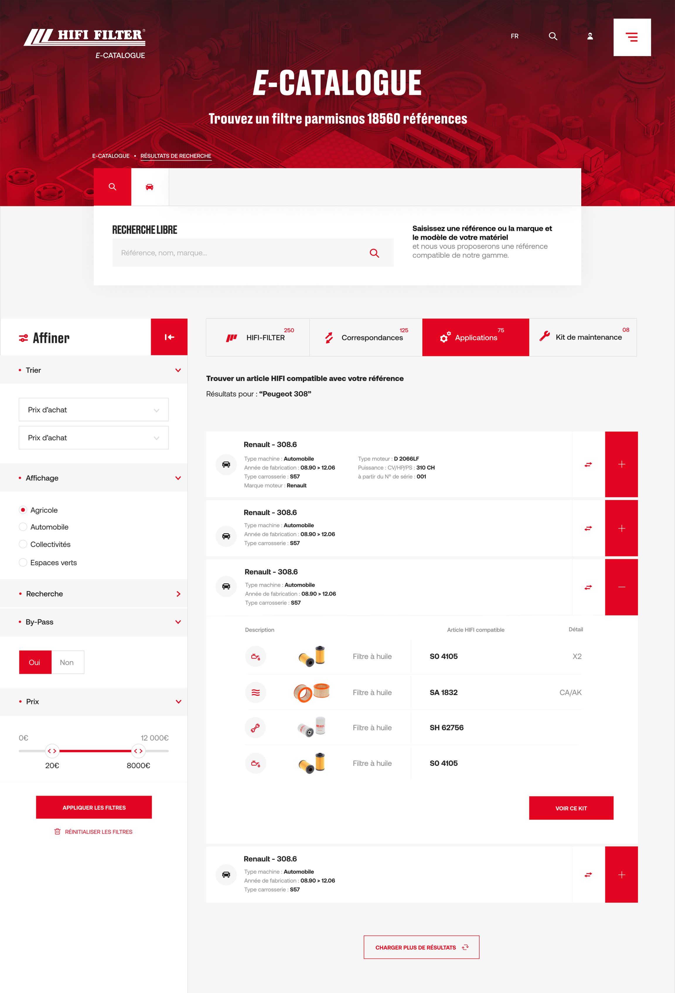
From the showcase site to the e-catalog
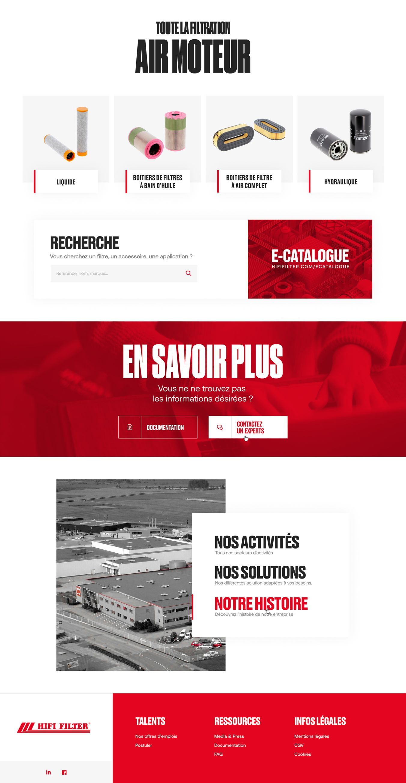
For this showcase website, Hifi Filter already had an e-catalog site intended for BtoB companies for specific orders of parts. The goal was to inform visitors as much as possible to encourage them to make a purchase. So we reused the code from the e-catalog site to create the front-end of this site, while Digitz agency took care of the back-end development.
